


Our data tools are powered by the Philanthropy Panel Study (PPS), a national survey about giving and volunteering. As you explore the data, this page can help you interpret what you find.
Understand the Data
Understanding the Survey
The Philanthropy Panel Study
This telephone survey is conducted every two years to families across the country. This is a panel study, which means the same families are surveyed each time. As families grow, the next generation of family members also becomes part of the panel study. Over 9,000 families participate in each survey.
Respondents are asked about their giving and volunteering habits in a given calendar year, as well as about their individual and family characteristics. For example, giving data is recorded for each family. Respondents are asked how much their household has given to each of 11 different sectors (or causes, such as religious congregations, neighborhood groups, or healthcare organizations). Volunteering data is recorded for each individual in the family. Respondents are also asked how many hours they personally volunteered, and if they have a spouse, how many hours their spouse volunteered.
Examples for Each Sector
Respondents are asked how much their family has given to each of these 11 sectors. Here are some examples of the kinds of organizations in each sector:
- Religion: church, synagogue, mosque, TV or radio ministry
- Combined Purpose: the United Way, the United Jewish Appeal, Catholic Charities, agencies of the United Nations
- Basic Needs: the Red Cross/Red Crescent/Magen David Adom, homeless shelters, food cooperatives
- Health Care and Medical Research: hospitals, nursing homes, mental health facilities, cancer/heart/lung associations or telethons
- Education: colleges, grade schools, PTAs, libraries, scholarship funds (but not tuition payments)
- Youth and Family Services: the YMCA, YMHA
- Arts, Culture: symphonies, museums, theaters
- Neighborhoods or Communities: Habitat for Humanity, neighborhood cleanup projects
- Environment and Animal Rights: Greenpeace, Sierra Club, National Wildlife Federation, zoos
- International Aid: CARE, Feed the Children
Drawing Conclusions from Sampled Data
Since it is not possible to survey every family in the country, we survey a small sample of families and use that data to make estimates about everyone else. That means we could be off, but this is our most reasonable estimate. When we are estimating based on a sample, the more families we survey, the more reliable our estimate. We can more reliably estimate about the country overall (because we have gotten data from over 9,000 families) than we can about college-educated people over 60 in Indiana (because we may only have data on 30 such families). Specific estimates like this are still useful and rigorous, but have a higher chance of being wrong.
One way to improve the accuracy of our estimates is to weight each sample. In other words, not every survey response counts equally. Imagine our population is made up of two groups of people, those who wear hats and those who do not. Now imagine that those who wear hats give more than those who do not. If our sample of families captured too many people who wear hats, we would think families gave more on average than they really do, because our sample did not represent our population.
To account for this, we would give more weight to responses from the underrepresented group (the hat-less families). Then we might get a more accurate estimate of the whole population. In our survey, characteristics like race, income, and education determine the weighting.
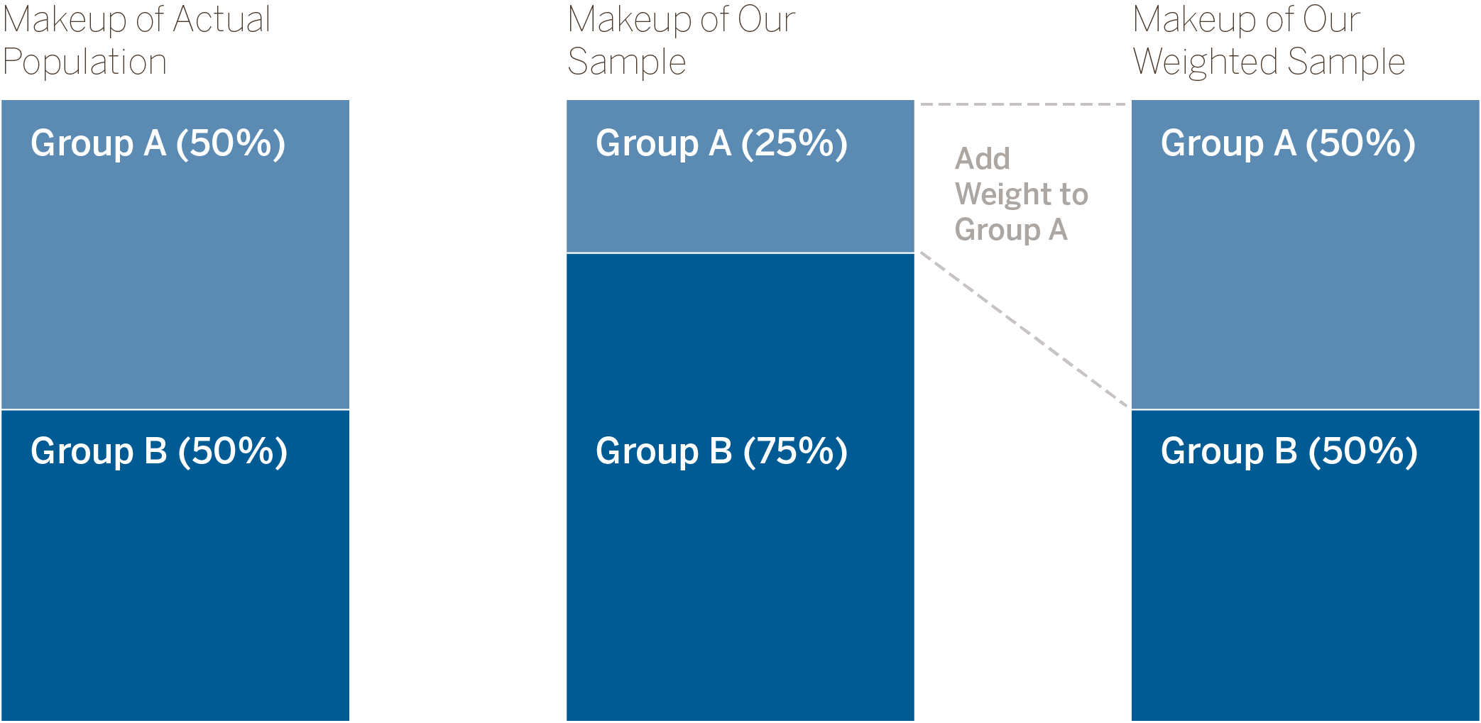
This survey uses a weighted sample. Because the demographic makeup of our sample does not match the makeup of the overall population, we add weight to underrepresented groups (Group A in the diagram). This lets us make more accurate estimates about the whole population.
Describing Survey Respondents
Because the survey measures family giving patterns rather than individuals, all demographics related to an individual (like race, age, working status) are based on the head of household. Demographics like income and marital status are based on the household unit.
Sometimes we break respondents into groups by age or income. The range for each group is designed to have relatively balanced samples. This explains why the age ranges used are not typical (age 31 or younger, 32–47, 48–60, and 61 or older). About the same number of respondents fall into each group, which allows us to make more reliable estimates about each age group.
Interpreting the Data Tools
Each of our data tools analyzes and visualizes the data in unique ways. We will explain how each tool should be read and clarify where the numbers are coming from.
Generosity Reports
When you choose a sector and a region, you are looking at data about families who:
· Live in the selected region
· Give to the selected sector
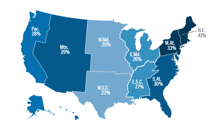
The map you see shows the estimated percent of households that gave to the sector you chose. In each of our data tools, darker colors on a map indicate higher numbers or percentages.
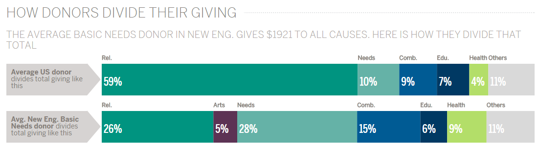
This chart shows how donors, on average, divide their total giving among the different sectors. It compares the average U.S. donor to the average donor from our selections. (Here we see the average basic needs donor who lives in New England.) The subtitle shows that the average basic needs donor in New England gives $1,921 annually to all charities. The bar chart shows this average donor gives 26 percent to religion, a smaller proportion than the average U.S. donor. We see they give more to basic needs than the average donor (28 percent), which is to be expected. But they also seem to give more priority to arts, education, and health charities than the average donor.
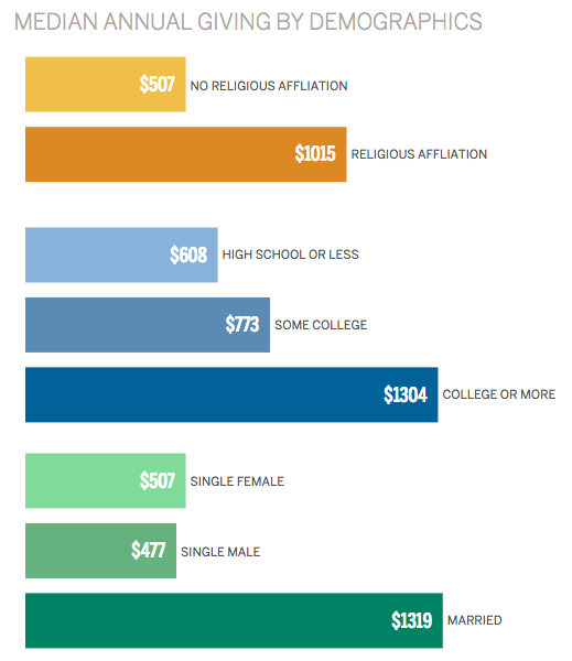
The section called “How Donors Gave” shows how different demographics relate to median annual giving amounts. For example, in the bar chart above, we see that there is a relationship between marital status and giving, as well as, a relationship between education and giving. We can also see that when it comes to giving, there is not much difference between those with some college and those with a high school degree or less. Graduating from college is what seems to make the difference.
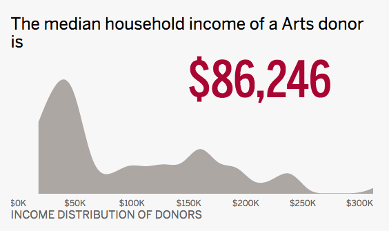
The “About the Donors” section is a demographic profile of people who give to the sector you chose to view and live in the region you selected. The chart above shows generally how donors are distributed across an income range. The most frequently seen incomes for arts donors in the Eastern Midwest region are in the $25,000–$60,000 range, but there is also a significant cluster around $150,000. Use these data to get a general sense of what a giver looks like.
The Volunteering Report is the only area of the chart not based on those who gave to the sector you selected. The survey does not collect data about volunteering in the same way it does for giving, so this section is instead based on everyone who lives in the region you chose.
Generosity Maps
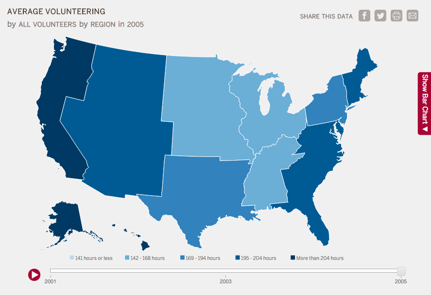
The Generosity Map lets us explore giving and volunteering patterns across the country. Like the maps in the Generosity Reports, darker colors indicate higher values. All red buttons are areas where you can change the data you see. You can filter the data by sector and demographics, choose a geography, choose a year, and view the bar chart. (On smaller screens like laptops and tablets, expand the bar chart by clicking the red tab on the right.) Explore the question menu to see the types of questions this tool can help you answer. Note that when you choose a sector in this tool, it does not filter for only households that gave to that sector. For example, if you choose “Arts,” you can see the average giving to arts for all donors, including those who gave $0 to the arts.
Give-O-Meter
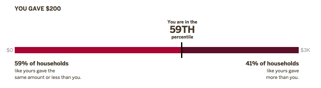
The Give-O-Meter compares your giving and volunteering to people like you, based on demographics you enter in a survey. Then you can easily share your results with friends on social media.
The bar graph you see shows your percentile for giving and volunteering—in other words, where you fall compared to other people. You are compared to all the people who match the demographics you entered in the survey. The numbers at either end of the bar show the minimum amount and maximum amount from that group.
Please note that this survey does not record any of your data, and does not contribute any data to the tools on this site.